This is a brand identity redesign proposal for TensorFlow made while embedded at Google with Hook Studios.
Art Direction / Design / 2D and 3D Illustration

We were tasked with updating the logo for TensorFlow, an open-source machine learning platform developed by Google.
Their existing mark was well-loved among the team of engineers, but they wanted to modernize it for their 2.0 launch.

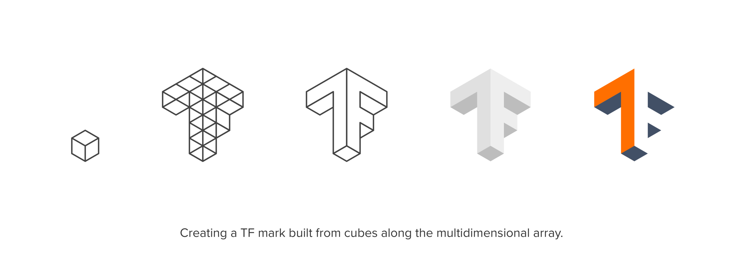
We cleaned up the geometry of the original TF shape with some negative space as a nice visual snack.

Full logo treatment with the TensorFlow wordmark set in Avenir Heavy.
Alternate color variations allow for versatility when faced with layout challenges.
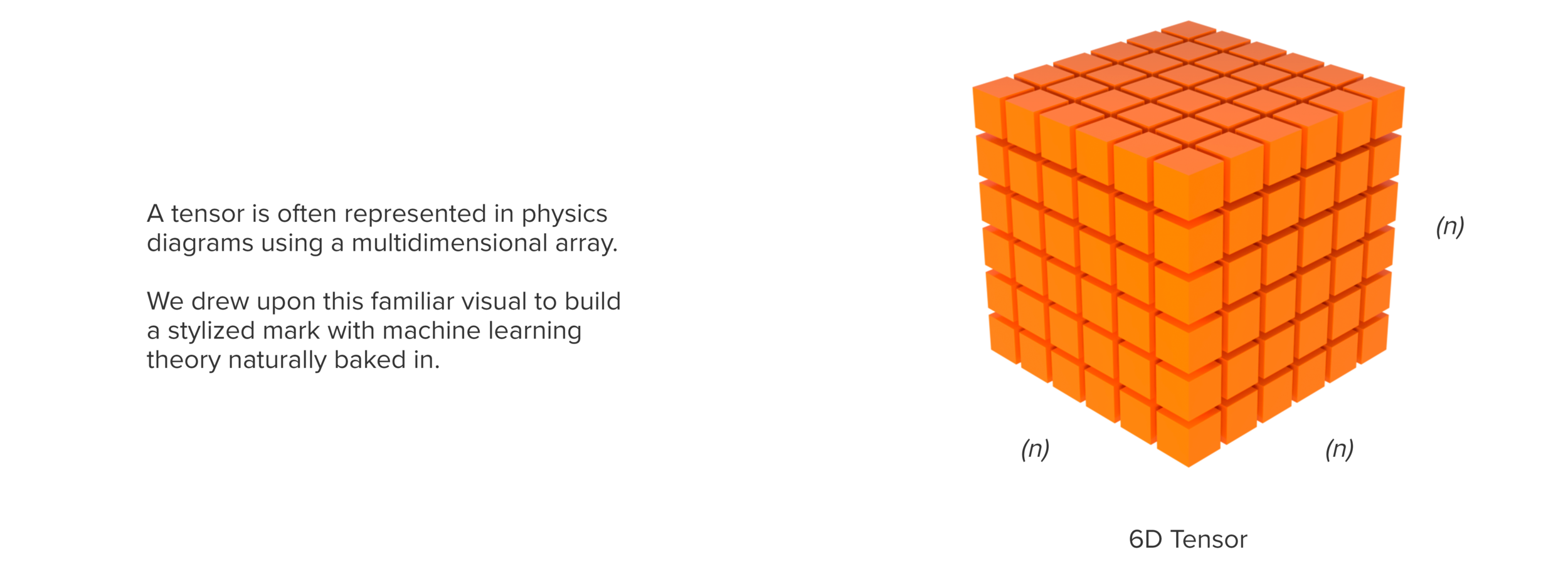
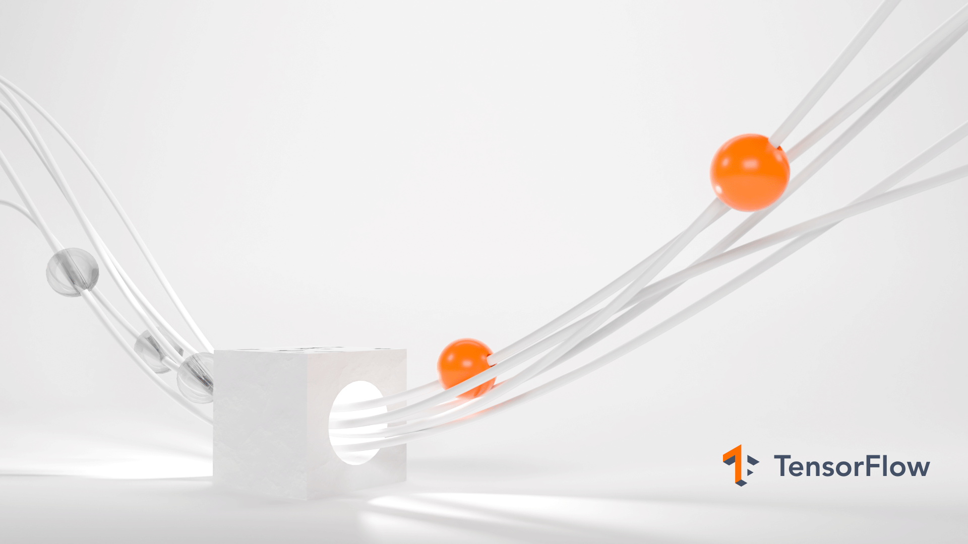
Machine learning can be a tough subject since explaining it relies on graphs and figures that don’t translate well to marketing materials.
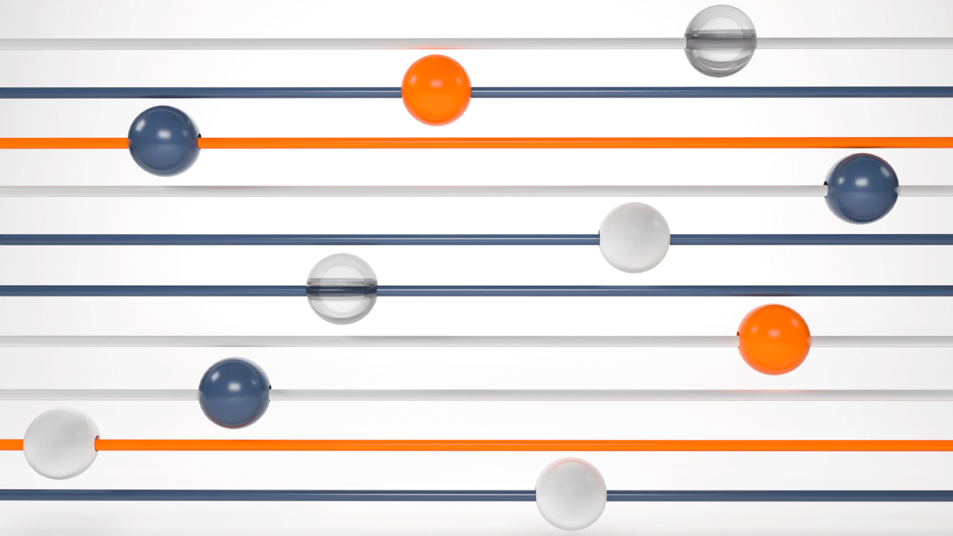
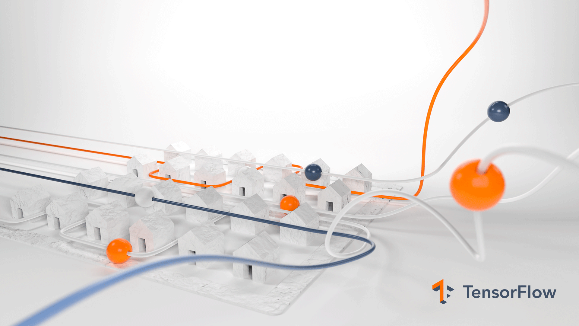
So, I developed a visual style for key art using 3D illustration techniques to help bring some tactility to the brand.

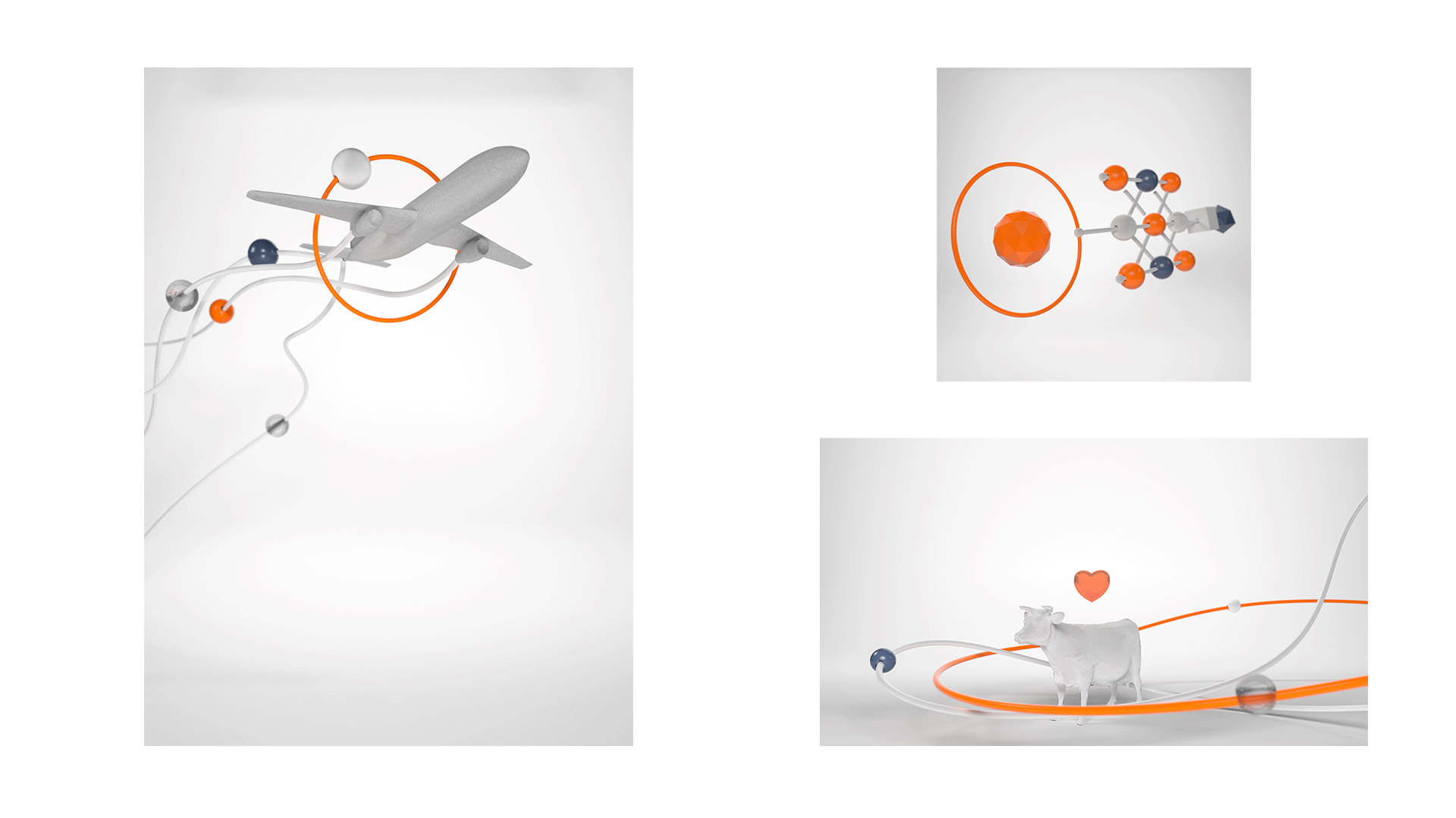

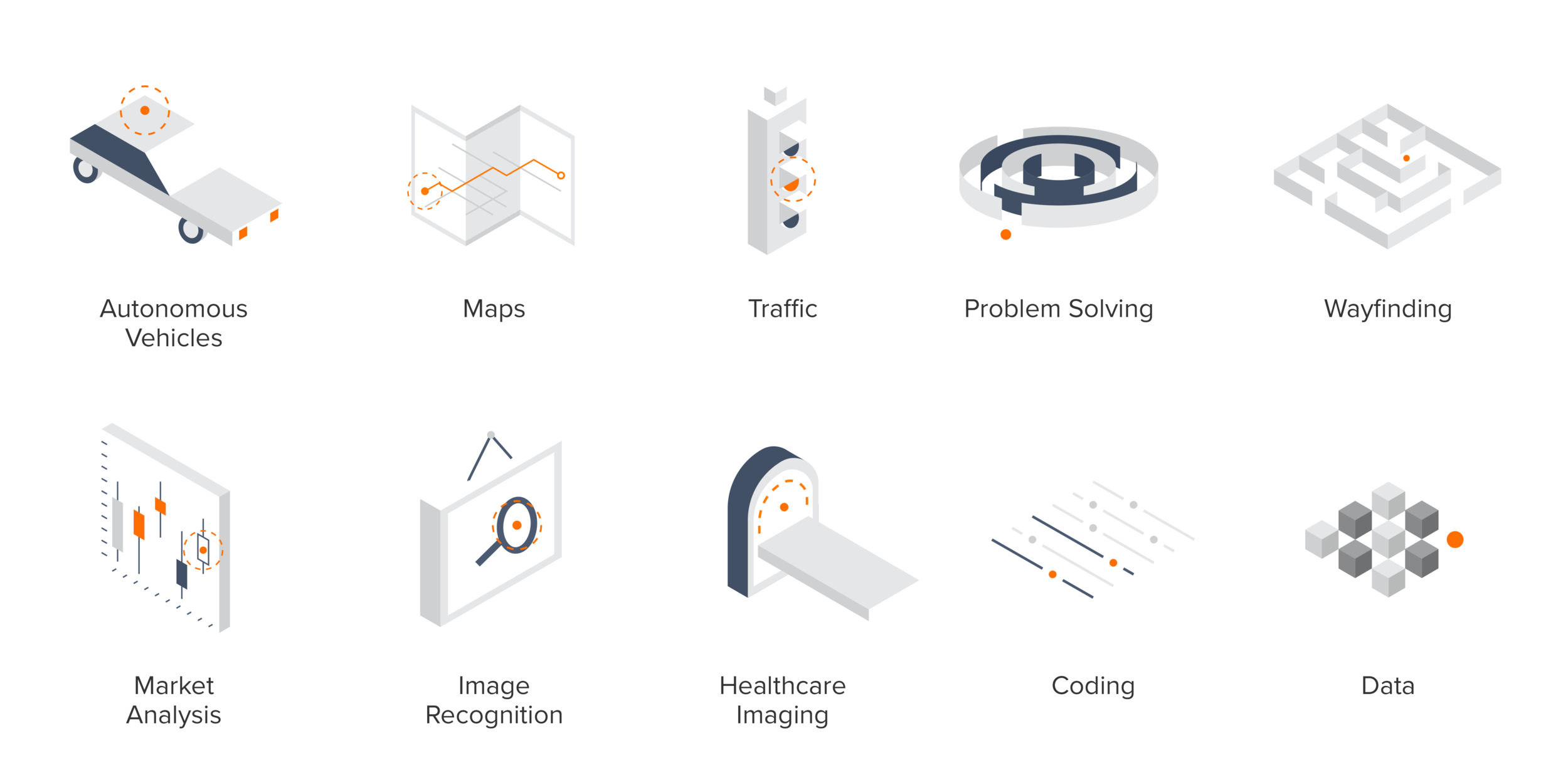
Additionally I developed a 2D editorial illustration style for quick turn-around jobs.
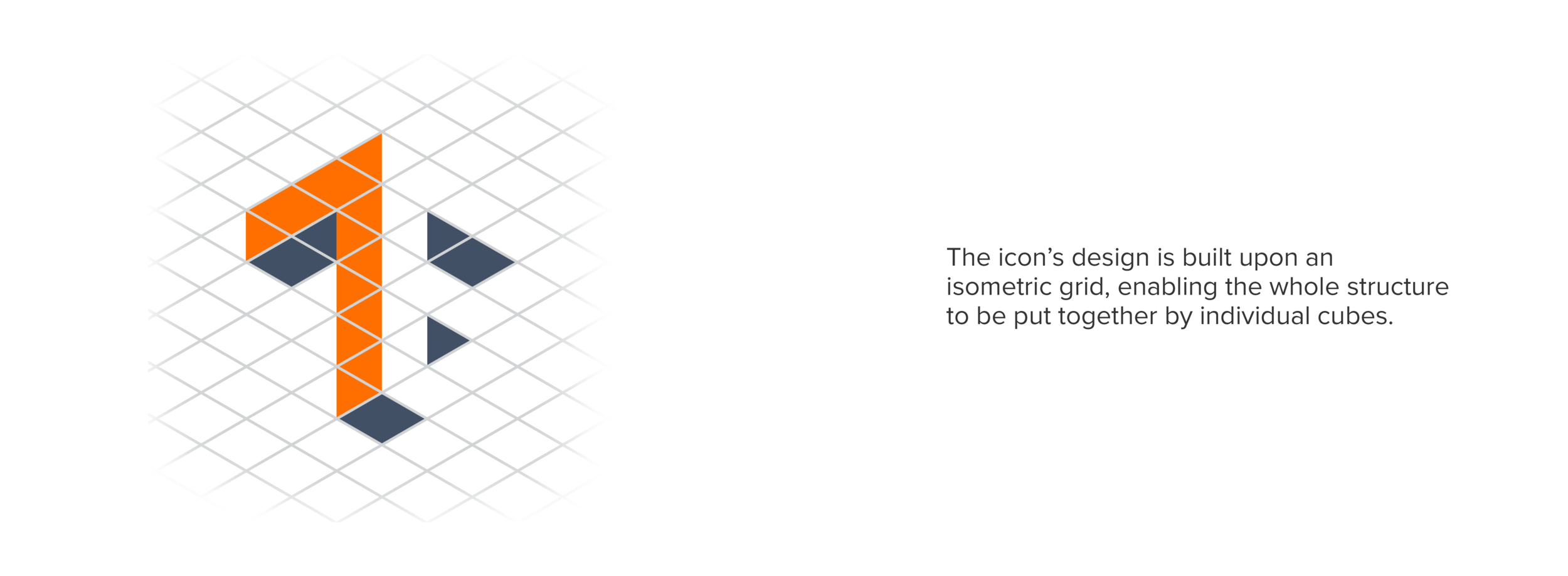
These all reference the logo, building off an isometric grid.

Every brand project comes with its own batch of iterations, and here are a few alts I liked from the process.

After much discussion and compromise between the Google engineers and marketers,
they settled on one of these alts for the final logo version.
